YouTube is the ultimate playground for content creators, but as a creator you often need, or want to enable people to jump out to other resources, perhaps a printable set of instructions or associated blog post, or perhaps to a different related video.
Traditionally, this has been achieved through “annotations” these were the text boxes that would appear over the top of videos, in little hotspots, and yes, they did the trick but let’s face it, they were ugly, they distracted and took the look away from that lovely content we took so long over creating.
To improve upon that, last year Google introduced YouTube cards, and these operate to a certain extent a lot like Twitter cards or facebook opengraph meta tags.
These allow you to add valuable additional information, including images, but in a tasteful manner, that not only doesn’t distract the user, but puts them in full control.
So what do they look like?
At a pre-determined time during the video, an info icon will appear in the top corner. After the first shwoing, the info cards are avalable to the viewer at any time simply by clicking the info icon.

Okay, all well and good, so how do I add one?
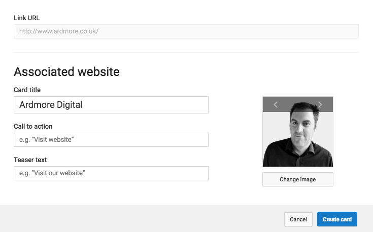
When you upload and add a video, you’ll see the “Cards” tabs where you can add the cards to your video.
Just like everything else in the video editor, you can come back and amend or delete these at a later stage if needed.

You’ll see that you can add up to 5 different cards, and what’s more, there are different types of card available for you to add, most often this will be a “Link Card” linking to an “Associated Website” or maybe to an approved merchandiser, but there you add cards for Video playlists or to create polls or even crowdfunding.
A Link card is the most common, but you can only link to “associated website” or a pre-approved website. You’ll need to be able to proved a link through e.g. google analytics, meta tag or DNS tags. But once you’ve done that, you can create your link card and customise the title, the image and the descriptive text.

Once you’ve filled in the blanks, and you’re happy with the card content, you then decide at whch point in your video the card should appear.
The handy timeline tools helps you to figure this out. It’s worth taking the time to make sure it appears at precisely the right moment
 And that’s it.
Looks good but does it work on…
Don’t worry, YouTube’s audience is now over 50% mobile, the cards feature works every bit as well on mobile & table as it does on desktop.
But is it working?
Of course, whether or not it’s working depends on your content and your card content – but as with all things Google, you can monitor and analyse performance by using the Cards Report inside YouTube Analytics, in there you’ll find the usual metrics such as number of times shown clicked etc.
To find out more, read Google best practices for youtube cards


